
The PS2's Foreboding Aesthetic
My history with the PS2, its disconcerting sense of style and the games that epitomise it best

By an absolute landslide, the topic of the PlayStation 2’s aesthetic won my recent poll, so that’s what I’ll write about! I have built my platform on Substack mostly discussing the run up to the Switch 2, my personal experiences in gaming, retro Nintendo and the occasional review and hot take here and there so I was surprised and humbled to see that people were even interested in reading something from me slightly outside the usual sphere.
Everyone loves the PS2.
Never in my life have I ever heard the words “I didn’t like the PS2.” Spoken out loud; I’ve met plenty who preferred the Gamecube and some the original Xbox, but not one person with a bad word to say about Sony’s seminal game machine. I’m not the only one either because Sony’s PlayStation 2 is the best-selling video game console of all time at about 160M million units sold; that’s more than the population of countries like Japan, Russia, Mexico and the Philippines, that’s way more than twice the population of the UK. It’s a number that’s staggering to imagine.
The memories are foggy now but I still vaguely remember unwrapping a Silver PS2 Slim for Christmas at either 5 or 6 years old and together with my Gamecube and GBA SP, my childhood trifecta of game consoles was formed; I later received others like the Xbox and N64 but these were really where it all began for me.
Why did you love the PS2?
For me? It was for games like Ratchet and Clank, Jak II (I never did beat that one) Jak 3, Timesplitters 2, Destroy All Humans, the Chamber of Secrets tie-in game, Prince of Persia: The Sands of Time and many, many more. I had almost 200 games for my system as a kid, back when you could walk into a game shop and get 3-4 games for less than £20.
But there was always something… off about the PS2.
When you boot up the original Xbox, you’re met with a bubbling green mass, a Chernobyl-esque background and that funny noise that tickles your brain ‘byeow-beep-beep-beep!’ This intro conveys the might of what was indisputably the most powerful machine of its generation.
When you boot up the Gamecube you get that iconic graphic of the little purple cube rolling around, it sounds almost like a xylophone, it’s playful and whimsical, even more so if you hold down the Z button and get the funky alternative intro.
What about the PS2?
Sony’s PlayStation 1 opened with a sound like you’d just arrived in hell but with the PS2, you’re just entering the gates and falling into… purgatory? I’ve never been able to work out what this visual is supposed to be but there’s just something so unsettling about it.
Many people when discussing consoles, especially Nintendo fans, talk about them having a ‘soul’ or ‘charm’ or a specific kind of feel to them. The PS2 certainly has that in spades, except instead of the bright and airy, family-friendly feel of the Wii, or the warmth and welcoming of the Xbox 360, the PS2 feels like some kind of entity that has possessed this black box and its chips and capacitors. It’ll play your copy of 007 Nightfire but it also might steal your soul.
Every child of my generation remembers the day they made the PlayStation 2 machine-spirit angry and fed it a disc it didn’t like, or thought it’d be fun to put Mario Kart: Double Dash into Sony’s little demon box.
In generations prior, when a game didn’t work you’d usually get a grey screen, garbled mess, or on consoles with a proper operating system, you might get spat back out to the menu with a message that the disc couldn’t be read; a little jarring but no problem.
Not with the PS2.
My favourite part of this is the subtle but tangible build up to the horror; it’s like the PS2 knows it’s about to scare you. The weird grey and glass blocks, which are usually all misshapen and dishevelled, as if they’re in a rush to prepare the game for you, have all been arranged still and lifeless, the camera seems to have been pulled back as well, just to make clear that what’s happening isn’t normal.
Then it hits you.
Pulled into this red, misty void, a sound like a heartbeat in the background, as if you’re being digested and the faint sounds of the ocean, or is it blood rushing through veins? Maybe I have an overactive imagination. The point is, you put in a disc the PS2 didn’t like and you got sent to hell for it.
Setting aside the creepy for a moment, I’ve always liked how the PS2 BIOS has a little cast of characters; those coloured lights. When you flick through the PS2’s system settings or access your memory card through the console, they follow you around, it makes the cold, haunted menus feel a little less lonely.
I always think of the PS2 as the PS1 but in ‘night mode’ or ‘after dark.’
The key features of the PS2 aesthetic to me are the colours black, dark blue and that urban feel with just a little dash of Y2K and Techno-Futurism. This look and feel extends deep into the PlayStation 2 library as well.
Next, I’ll talk about some games that exemplify this aesthetic best. I want to make it clear that this isn’t a list of my favourite PS2 games (although one of them is) just some of the games I think aesthetically match the system best.
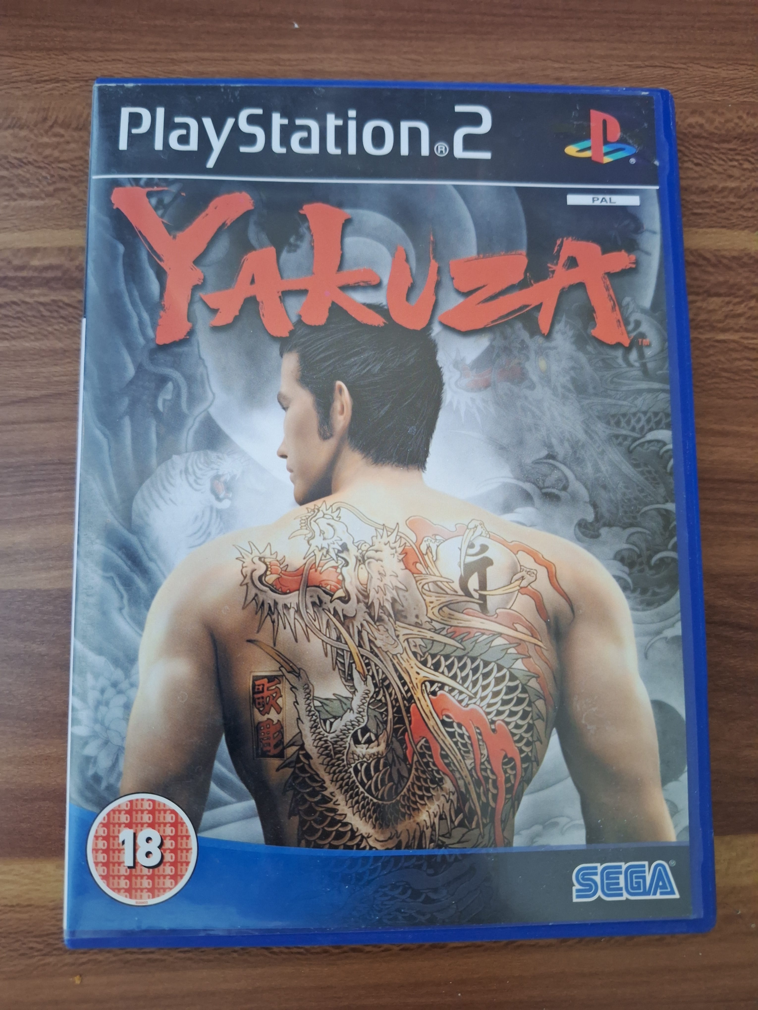
Yakuza
Publisher: Sega
Developer: New Entertainment R&D Department (Sega R&D 1)
I mentioned this game in a note a few days ago, I’m not going to discuss the games deeply outside of their aesthetic but I will say that the Yakuza/Like A Dragon series got a pretty rough start on the PS2, however, this is a particularly good looking game for the console, and a very late release too, arriving in September 2006 in Europe.
The game’s frequent use of fixed camera angles felt very dated by this point but the advantage to a fixed camera is that you can create some very artistic shots.
 2515402")
*Screenshot from GameSpy, RIP

There are a few reasons Yakuza sticks out to me as a very PS2-feeling game, besides the obvious.
Firstly, a lot of the appeal of Kazuma Kiryu: the lead of the franchise, is his fish out of water characterisation, in the game, he was in prison for 10 years: from 1995 to 2005, and therefore is somewhat out of his depth in the world of the new millennium. As someone who grew up in this zeitgeist and grew up watching the rise of things like smartphones, LCD TV’s and the proliferation of high speed internet without the cynicism of adulthood yet, the game really reminds me of those times and the PS2’s aesthetic itself is very much of that era, so they compliment each other nicely.
Another way Yakuza epitomises the PS2 aesthetic is via its tone: Yakuza is a moody game. It’s not gritty and shit-brown like a lot of games after it and it’s not colourful and cartoonish like a lot of games before it, Yakuza achieves a moody tone that only the PlayStation 2 was capable of producing, with its muddy video output and developer’s willingness to adopt a moody tone, something we don’t see as much today.
A last little bit that does it for me is Yakuza’s mini-map; it’s ripped straight out of the PS2-era GTA games and is a real symbol of that time in gaming for me.

Tekken 4
Developed and Published by Namco
Tekken 4 is widely considered the black sheep of the franchise (unless Tekken 8 gets even worse.) Its gameplay innovations were not well received, it lacked the balance and polish of Tekken 3 and lives in the shadow of Tekken 5: the fan favourite. That being said, Tekken 4 has won enduring appeal through its music and aesthetic, which I think are very emblematic of the PS2.
My first example is the intro. cutscene itself.
The military equipment and glassy, corporate locales are very dark Y2K, the music is exactly what I’d expect to hear from a Japanese game of its era and once again, Tekken 4 is very moody in that specific kind of PS2 way; it’s not appealing directly to adults like the Xbox, nor bright and cheerful like Gamecube, the PS2 and its library had the confidence to be unapologetically moody.
I don’t want to flood the article with links but Tekken 4’s moodiness particularly stands out when you see the Tekken 5 intro. after.
I mentioned before that I think of dark blues and blacks when the PS2 comes to mind, well Tekken 4 is full of that colour palette and it extends far beyond the box art.


Aside from the aesthetic, the decision to even make these storyboards speaks of the PS2 era as well. It was too early around Tekken 4’s 2002 release date to really take full advantage of the difficult to program for PS2, so fully animated, 3D cutscenes were best avoided unless you had a towering budget.
It’s a small detail that you might miss if you were distracted by Nina Williams’ other ‘features’ but her sunglasses are very of the time as well, they remind me of Michael Schumacher’s Oakley Pennys or Mila Jovovich in Ultraviolet.

METAL GEAR SOLID 2: SONS OF LIBERTY
Developed and Published by Konami
A Hideo Kojima Game
Starring David Hayter as ‘Solid Snake’
Quinton Flynn as ‘Raiden’
Christopher Randolph as ‘Otacon’
Guest Starring Sons of Liberty Mercenary Group
Metal Gear Solid 2 is an essential title for the PS2; if it wasn’t for Metal Gear Solid 3: Snake Eater being my favourite video game of all time, it would easily be my pick for the greatest game on the system. Part of why it fits the console so well is that it took great advantage of the mixture of paranoia and excitement around the Dot Com Boom and the explosion in popularity of the internet around the turn of the millennium; as I touched upon in the Yakuza section, the PS2’s lifespan was from 2000-2006, right in the middle of this cultural and economic zeitgeist.
I don’t want to spoil the game for those who haven’t played it because it’s one of those games that everyone should play once but the kinds of questions MGS2 poses, the predictions it makes and the palpable fear of how things like the internet could be used really hearken back to these more sheltered days, before my Xbox One had Skype and my PlayStation had a £19.99 a month subscription to play cloud-based, £2 PS2 games.
Refocusing back to the aesthetics, MGS2 has a very cyberspace feel to it, an aesthetic I strongly associate with that place and time, and with other PS2 games as well.

This extends to the technology depicted too. The PS2, Gamecube and Xbox were really the final CRT generation of consoles; the Wii also requires a CRT but unlike this generation, it looks completely fine even when very crudely upscaled. As a result? This virtual world and sci-fi stuff clashes with the predominant use of CRT monitors and the late 90’s-early 2000’s archive footage used in the game, giving it all a very retro feel in that specific early 2000’s, PS2 kind of way; it’s a world we lived in once but not the one we recognise around us now.
This post is getting longer than I wanted it to, so I’ll throw in the towel here, but not before presenting this week’s poll.
Scanlines’ Journal is just about to hit 40 Subscribers and it’s always great see new and returning readers down in the comments, if you’ve been sat on the fence for a while or enjoyed this article, don’t forget to hit that Subscribe button and leave me a Comment below.
The PS2 is a central figure in some of my very happiest memories. Some of the spookiest, too: I literally had nightmares about the RSOD as a kid. Worth it, though. It's my pick for best aesthetic and best library of games of any home console ever. Today's big-money industry is all but devoid of the anarchic, experimental spirit that characterized the sixth console generation. Luckily, us folks who were inspired by it never went anywhere, and the spirit lives on in indie games and thoughtful retrospectives like this one. Hope we get your take on the Dreamcast aesthetic, too!
Dear gawd, was Pinhead the lead designer of the RSOD screen?!? Being in Team Xbox at the time I'd never seen this before. The horror!